Contextual Looking: Display, Labeling, and Visual Culture
Why context matters
Artworks do not exist in isolation. The way a work is displayed, the label beside it, and the surrounding objects all shape perception. Two simple experiments help reveal how much context affects what you notice: looking without labels and looking with labels. Each produces different insights that you can use in the studio and in interpretation.
Looking without labels: first impressions
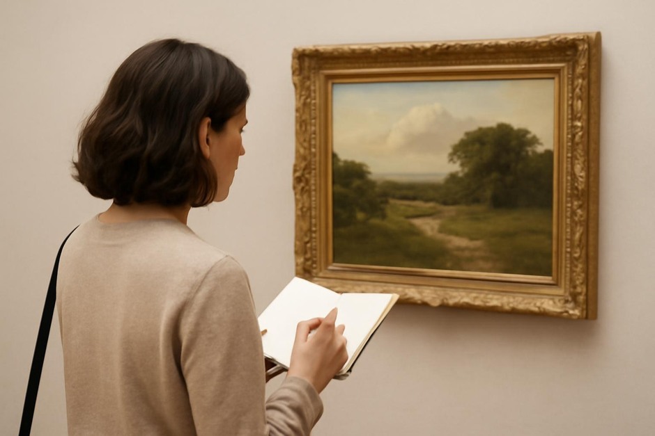
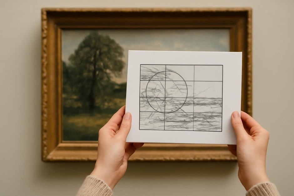
Begin by viewing an artwork without reading any explanatory text. Spend a few minutes recording immediate impressions: form, material, mood, and any compositional features that register first. The aim is to uncover what the work communicates visually without an imposed narrative.
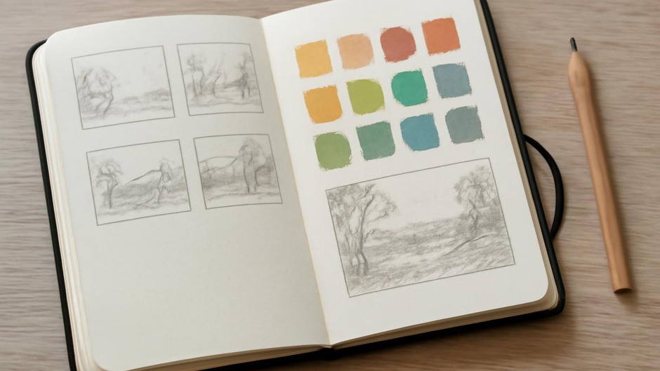
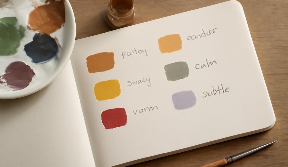
This approach highlights the visual cues that most directly guide our attention. It is useful for developing visual literacy because it forces you to rely on observation rather than external framing. In your sketchbook, record a short thumbnail and a few single-word notes about what stood out.
Looking with labels: informed perception
Now read the label and consider how the new information changes your perception. Labels may point to technique, historical context, or the artist’s intention. Note what you would not have guessed from looking alone and consider how the label reframes the work.
Use the sketchbook to make a comparative note: add a second thumbnail or overlay a few lines of commentary. This exercise trains you to negotiate between immediate visual evidence and contextual knowledge, a skill that is valuable when translating museum observations into your practice.
Comparing the effects
Unlabelled looking preserves the primacy of visual evidence; label-informed looking acknowledges the interpretive frame. Neither is more correct. When you combine them, you gain both raw perception and informed perspective. Practically, this means your studio decisions can be driven by what you first saw while being enriched by techniques or histories you learn afterward.
Display factors to notice
- Placement. Observe whether the work is hung at eye level, grouped with other pieces, or set apart. Proximity to other works affects relational reading.
- Lighting. Note how light models the surface. Direction and intensity change the visibility of texture and colour.
- Label tone. Pay attention to whether a label is strictly factual, interpretive, or pedagogical. Each tone invites a different kind of looking.
Practical sketchbook routines
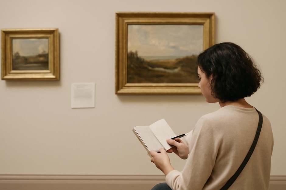
Try an alternating page method: on the left page, a pure visual study done before reading the label; on the right, a label-informed study and a short note on how your reading changed. Over time, these paired pages become a record of how context reshapes perception and of which visual cues remain consistent regardless of framing.
Use these observations to inform studio experiments. If a label highlights a particular technique, test it while keeping your initial visual priorities in mind. This practice encourages your work to be both perceptually grounded and contextually informed.
Closing thought
Contextual looking trains you to be flexible: to hear the artwork first through its surface, and then to integrate the broader picture. The combination deepens your understanding and gives you a richer starting point for creative work and thoughtful interpretation.